Colorize the buttons
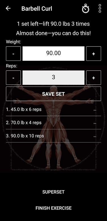
While I appreciate the slick appearance of the app, it would be helpful if after completing a set the three buttons looked a little different (different colors?). When I'm not thinking clearly because all the blood has left my head and is in my muscles, I tend to hit the wrong button. If they looked a little different (white button, black font?), then maybe I'd make less errors.
Answer

Interesting idea Mac. Which buttons are you referring to here?
Is it the "Save set" button you'd like to make white with black font?

I'd suggest coloring the Save Set button so that it looks different from the Finish Exercise button. And the Superset button should also look different from the Finish Exercise button. You pick the colors.

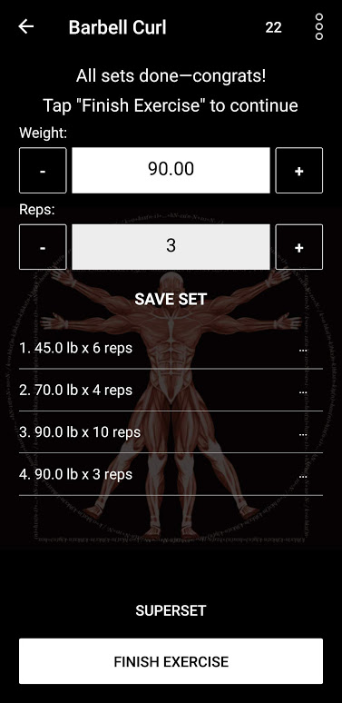
Wow! Almost looks like you read our minds with that suggestion. We've already done somthing similar! Currently in alpha; will get rolled out with the next update. Have a look:


We might switch that layout around a bit; but like you suggested, when all your sets are done, the "Finish exercise" button will be emphasised, and the others won't.
Thanks for your suggestion! I'm marking this one as complete. Will get back to you later re other suggestions.

I agree with the black and white variations, more colors could be distracting
Customer support service by UserEcho

Wow! Almost looks like you read our minds with that suggestion. We've already done somthing similar! Currently in alpha; will get rolled out with the next update. Have a look:
We might switch that layout around a bit; but like you suggested, when all your sets are done, the "Finish exercise" button will be emphasised, and the others won't.
Thanks for your suggestion! I'm marking this one as complete. Will get back to you later re other suggestions.