- Feedback
-
 Questions

0
Menu UI Consistency
Notice the menu is different for the first exercise vs the one below. It’s always skewed on that
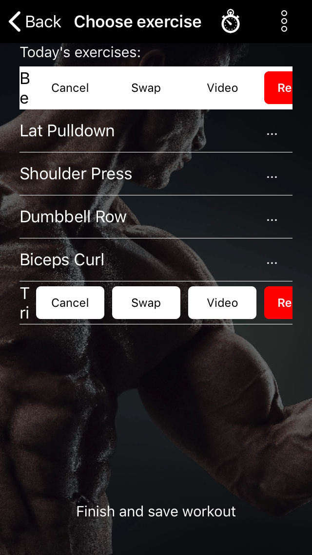
first one.
Customer support service by UserEcho
Notice the menu is different for the first exercise vs the one below. It’s always skewed on that
first one.
Customer support service by UserEcho

Considiring the current excersice si whitered, this seems normal to me...?
I don't understand the the issue. What does UI mean?
It's the User Interface... The way the app looks and how easy it's to use/understand.
I just wanted the top to look the same as the bottom.
But it works the same. Just not a consistent look. At least on my phone.
If you make one tap on Shoulder press, it's should turn white and the first one will stop to be white. Maybe the issue you are trying to say is if i tap the menu to switch and etc, remove the selection... I am right ?