+3
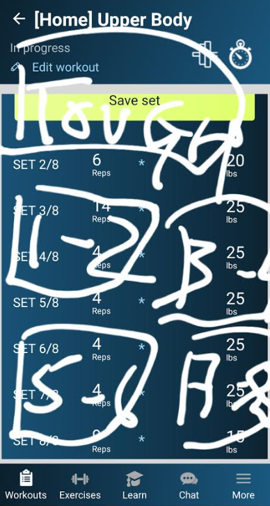
Fullscreen buttons for feedback on how hard the sets were
Hi,
I noticed a recurring pattern of errors on my part recently, when I'm providing the app feedback on how much further
can I push. After finishing the 2 warm up sets and subsequently the first proper work set, a list box appears asking whether I can do more. Invariably, probably because of my shaky hands, I've unintentionally selected the wrong option. I was wondering if squares instead of a text list can be leveraged here.
[Edit: Carl asked for a mock-up.]

Customer support service by UserEcho
