- Feedback
-
 Ideas
Ideas

Progress Logs
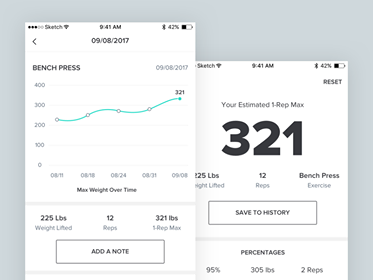
I think the progress reports and logs could use a bit of improvement. The graph shows the 1RM change over the past three workouts. That's fine. But below that is a long list of exercises performed recently. I don't think this is very helpful. Bodyspace and to a lesser extent JeFit both had reports that showed graphs and reports that provided long-term data. One measurement that I liked (but really wasn't useful) was "total weight lifted to date". When I hit 1,000,000 lbs, I felt like I'd hit a major milestone, then I hit two-million, and so on. I knew it wasn't really a worthwhile number, but it was something to keep watching increase. The more data the better. We're each odd in what inspires us to keep going.
As an aside, it was critical for me to learn that by marking "very, very hard" after the working set would often not increase my weight on the next exercise. This was disheartening to see my 1RM decrease. Now I put the truth, which is that I can almost always lift "1-2 more reps", and this keeps the weight gradually increasing each workout. I need to know that I'm improving. The more data the better. Yes, I do trust the app, but we like to "trust and verify", by seeing the data as we stick to the plan.
Answer

Hi Mac!
Thank you for your ideas, and the update re "very, very hard". I'm glad to hear you're making progress again.
On the chart page, you can change the timespan and exercises by tapping on the white fields at the bottom. That way, you can see all of your progress for each of your exercises visually. Is this what you had in mind?
I see your point on total weight lifted to date. Would you like me to create a separate feature request just for that one?
Thanks for the update, and happy holidays,
Carl

I did add it. There is it : https://muscle.userecho.com/communities/1/topics/126-total-weight-stats I was about to suggest it anyway.
I see the info for the progress logs, but it's not "pretty" to look at. I understand that "Dr. Muscle" is for the serious lifter and that serious lifters shouldn't need a pretty app, but I've been lifting 3x a week for almost three years, and I too need motivation to keep going. The AI is THE primary draw to Dr. Muscle, but even I need the cutesy gimmicks to keep me motivated when the AI isn't enough.
BB.com has a feature that shows a colorful bar graph for each day/week/month of how much weight lifted. It's a fun way (though maybe not very useful) to feel good about having lifted more weight in January vs December. It also shows the total weight lifted since starting the program. I was committed to BB to hit the one-million mark, then I hit two-million about a year later. I didn't abandon BB.com until I hit three-million.

One thing I’ve been finding odd since I’ve used the app is that when you’re in an exercise and then go to the training log/charts, it always brings up the average of all exercises first (I’ve no idea how you would interpret that) rather than the specific exercise you’re currently in (which is always what I’m interested in, eg to see the reps/weight or 1RM chart for previous workouts). Going straight to the exercise you’re currently in would save a bit of time.
Thx for your comment Jamie. I agree they need work.
The default view shows the exercises you've trained at least 3 times in the last 4 weeks. It's your average strength progression.
I look forward to improving the charts (when this becomes the most voted feature).
+1
Is there any compelling reason the summary line for each exercise and the detail lines have Reps and Load in opposite order?
Being new to this weight stuff, I don't understand the significance to me of the summary information, however summaries tend to be more important than the details, yet you've made the summaries smaller than the details. Usually the important stuff is larger to draw attention to itself and be easy to read.
If the summary info is actually important, shouldn't all of them be available together without having to wade through all the details? The benefit of summaries is generally to save wading through all the details.
You might consider starting with a list of summaries each of which could be tapped to expand it to the underlying details.
When looking at the button (heading?) at the bottom that reads "Average of all exercises" I expect there would be some actual averages, but there are none, only details and sums.
While looking at the log, I took the Settings option to switch from metric to pounds. When I returned to the log, it was still metric. The weight system ought to be applied when it's specified.
When I tap a line other than over the right-hand buttons. the line highlights. I found no use for the highlighting. If there isn't one, the line should not highlight.
Also, the highlighting never goes away. It can jump to another line, but never returns to normal.
BTW, what does 1RM represent. Am I the only one who hasn't figured it out? If not, maybe 1RM is a poor choice to title data.
Charts.
Is there a compelling reason the menu says Logs and Charts, but the subsequent heading buttons say Charts and Logs.
The opening sentence saying I have finished st least three sessions of the following exercises sounds like the app has lost track of the number.
It's clear that the app is fixated on a 3-.point graph and the above sort of apologizes for that. Wouldn't it be clearer to show one or two points for those who have completed only one or two? The title could be Recent Exercises and forget about the apology.
On the three point graph fixation... right from the beginning the app shows new users a 3-point graph. That makes no sense. It confuses folks who are likely to be confused anyway.
Back to charts. Putting the list of exercises in paragraph form is the worst way to present a list. Make it a scrollable list.
The same is true of the last two sentences. These data are clearly represented in tabular form. Putting them in sentences , particularly sentences I have to scroll to see, makes the page less useful.
It seems to me s basic in design is missing. When setting up a page, ask yourself what is the most important message. That should be the easiest to see. My guess, for the numbers , is the change... the numbers I have scroll to see.
The list of exercises is probably one of the least important pieces of information. Maybe of so little be should be dropped.
Thanks for voting for this feature -- it's done!
Inside the app, you can now view your total weight lifted (home page) and long-term data (top-right menu > training logs & charts). The charts can now show:
- Your average progress over your last 3 workouts
- Exercise by exercise data for 1 month, year, or all time.
To update:
- Open the store app on your phone
- Search for Dr. Muscle
- Tap update
You can also view this data on the Web at https://my.dr-muscle.com/.
Now would be a great time to suggest and vote for our next feature. If you'd like to do that, please visit: https://muscle.userecho.com/communities/1-submit-your-feedback/topics#.
Really appreciate your support and advice. Thanks!
Carl Juneau, PhD
Founder of Dr. Muscle
Customer support service by UserEcho

Thanks for voting for this feature -- it's done!
Inside the app, you can now view your total weight lifted (home page) and long-term data (top-right menu > training logs & charts). The charts can now show:
- Your average progress over your last 3 workouts
- Exercise by exercise data for 1 month, year, or all time.
To update:
- Open the store app on your phone
- Search for Dr. Muscle
- Tap update
You can also view this data on the Web at https://my.dr-muscle.com/.
Now would be a great time to suggest and vote for our next feature. If you'd like to do that, please visit: https://muscle.userecho.com/communities/1-submit-your-feedback/topics#.
Really appreciate your support and advice. Thanks!
Carl Juneau, PhD
Founder of Dr. Muscle