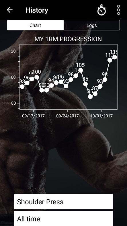
 Follow a Single Exercise in History
In order to easily see the progression of an exercise and/or perhaps build upon that in the next training phase, it would be useful to select a specific exercise in the History menu. I understand this is not of primary importance perhaps for now, but if I don't post it now, I'll forget it, lol! Cheers!

With the latest update, you can view a single exercise at a time. In the chart and in the logs. I'm marking this feature request as "Completed".
Thanks!
* * *


 How do I know when I'm in a de-loading phase?
Maybe also explain that missing a rep range may drop your sets on subsequent workout but that is normal and is necessary to prevent over training and get you back on track to hit new max's. Putting together a demo that walks through a few cycles and demonstrates these different scenarios would be very helpful.

This feature is now live in beta. For more details, check out http://drmuscleapp.com/news/deload/. We should roll it out public by the end of the week. I'm marking this as "Completed".

 Delete saved sets / exercise history
I saved sets by mistake and now I can't delete them.

Released in beta today. Will be made public this week. I'm marking this as completed. Yeah!

This new feature is now available in beta. Should be out in public next week. I'm marking it as "Completed."


 User-Created Exercise with "Similar to..." Option
Request:
When adding a user-created exercise, allow the option to select an existing exercise it is similar to and optionally port over history, latest weight, and reps from that exercise. This would also assume the same muscle group worked.
Suggested Functionality:
When creating a custom exercise, provide an option to select a similar existing exercise as a reference.
Optionally copy over:
- Recent history (previous sets, reps, and weights).
- Latest working weight and reps for continuity.
Users can choose whether to start fresh or maintain progression from the similar exercise.
Benefits:
- Reduces setup time for custom exercise variations (e.g., switching from barbell bench press to a custom "Paused Bench Press").
- Ensures progression continuity for similar movements.
- App AI can assume this lift is "similar" to the selected lift.
- Prevents the need to manually re-enter workout history for slight variations.
- Would streamline adding custom exercises while preserving usefultraining data.

 Renaming exercises
It would be helpful is one could rename excercises. I can always add more exercises with a different name, but if I do so, I lose the workout history.
One example for the need to chsnge the name is when I do the exercise with a different brand of a machine. It would be helpful if I can rename the exercise by adding the machine brand to the name, and then create a new exercise for the new machine. That way I would not lose the workout history for the old machine.
For example, in my gym there are at least five leg press machines from five manufacturers, and on anoher gym I visit regularily, there are three more. Each has a slightly different resistance or feel to the exercise.
Another application would be wheI create a new exercise and I notice a typo in the name; or if I forgot to add which variation of an exercise It It (like medium/light/heavy), or leg position, or exercise cadence, etc. If I want to change the name, I have to delete the exercise (and exercise history) and create the exercise anew.

 Recommend additional exercises
It might be helpful if you could recommend additional exercises if I selected not to end workout

 Being able to rename exercises once they are in your program
To remind yourself of the different machine used or hint at the modification from original exercise

Hi JM,
Thanks for your feedback.
Until this gets more votes, you can achieve something similar by tapping the "..." next to any exercise and selecting "Note." I use it to enter reminders about equipment, position, and other modifications. This way, you can keep track of any changes or specifics related to each exercise.
I hope this helps.
Best,
C

 Making changes to the inactive sets
When I start the workout, I can see all of the exercises, sets, reps and weight for every set. Hower, I cannot make any changes to the weights other than the next set - the first warmup set of the first exercise when you are just starting the workout. It would be nice if one could make changes to weights for the entire exercise before starting and not in the midst of the workout.
The need can arise for example if you are using a machine that uses odd increments, like when the plates in the weight stack are in pounds but marked in kilos (e.g. 10 lbs is roughly 4,5 kilos but the app uses 2,5 kilo increments).
This might be a minor issue, but fixing it should be also a minor issue, and the end result would be better.

Hi again Seppe,
Nick is correct -- in this case, you could simply customize your increments for that exercise under Exercise settings (tap "..." next to the exercise to access).
In many cases, the app dynamically adjusts your weights during your sets, so I'm not sure that letting you change them before you start would turn into a smooth experience. Better try customizing your increments instead. If you have more questions, please email us at support@drmuscleapp.com.
I'm going to leave this open in case more people want to vote for it.
All the best,
Carl

 Longer weight trend graph
It would be good if the weight trend graph was for a longer period of time than just a few days, or it could be customised for the period wanted.
Customer support service by UserEcho
